
Charts, Graphs, and Diagrams in the Presentation

Do you have to give a presentation? But do you know how to make it attractive to your listeners attractive to your listeners? Charts, graphs, and diagrams can help you cope with this task.
This kind of visual content helps your audience see what you are talking about. That’s why it’s so important to understand the way it works and know how to describe, charts, tables, and graphs correctly. You will also need this skill to be able to complete one of the IELTS tasks, which is usually to describe and discuss a diagram or any other visuals with figures and facts.
Now let’s see the video “Types of Graphs and when to use them”
Why do you need to use charts, graphs, and diagrams
A lot of presentations are focused on data and numbers. Sounds boring, right? Apart from essential business presentation phrases, charts, graphs, and diagrams can also help you draw and keep the attention of your listeners. Add them to your presentation, and you will have a profound evidence-based work.
When it comes to presenting and explaining data charts, graphs, and diagrams, you should help people understand and memorize at least the main points from them. As to the use cases, diagrams and other visuals perfectly fit for describing trends, making a comparison or showing relationships between two or more items. In other words, you take your data and give it a visual comprehensible form.

What is better to choose
There are so many different types of charts, diagrams, and graphs that it becomes difficult to choose the right one. The chart options in your spreadsheet program can also greatly puzzle.
When should you use a flow chart? Can you apply a diagram to presenting a trend? Is a bar chart useful for showing sales data? To figure out what to select, you must have a good understanding of the specific features of each type.
The rest of this article will show examples of different types of presentation visuals and explain in detail how to describe charts and diagrams.
Graphs, Charts & Diagrams
Data can be represented in many ways. The 4 main types of graphs are a bar graph or bar chart, line graph, pie chart, and diagram.
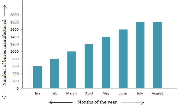
Bar graphs are used to show relationships between different data series that are independent of each other. In this case, the height or length of the bar indicates the measured value or frequency. Below, you can see the example of a bar graph which is the most widespread visual for presenting statistical data.
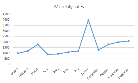
Line graphs represent how data has changed over time. This type of charts is especially useful when you want to demonstrate trends or numbers that are connected. For example, how sales vary within one year. In this case, financial vocabulary will come in handy. Besides, line graphs can show dependencies between two objects during a particular period.
Pie charts are designed to visualize how a whole is divided into various parts. Each segment of the pie is a particular category within the total data set. In this way, it represents a percentage distribution.

Diagram is a plan, drawing, or outline created to illustrate how separate parts work and overlap at the connecting points.

Final words
Before creating charts for your presentations, determine what data you’re going to show and design the visuals tailored to your audience. Keep them as simple as possible. Charts, graphs, and diagrams should explain themselves. Use the words and their multiple synonyms mentioned in this article to describe your graphs and help your listeners understand the importance of your data. And don’t forget to add an inspiring quote to make your speech even more impressive.
FAQ about how to describe charts & graphs
How do you describe a bar graph?
Bar graphs divide the data into separate bars and lets you track progress over time. To describe the graph, follow the trend from left to right and describe if it does down, up, or stays the same.
How do you describe a line graph?
A line graph plots data in a single line over time. To describe the graph, follow it’s progress along the horizontal access and describe whether it goes down, up, or stays the same.
How do you describe a pie chart?
A pie chart divides data into separate sections to show which individual parts make up the whole. To describe the chart, compare each “slice” of the chart to the others to determine what share of the total each category has.
Source:
MooMooMath and Science
Preply.com


Nama: HelmaYanti Hamid
Class: EFBE B
Nama :siskapuspitasari
Class : EFBE K
Name: Melin novi yanti
Class: EFBE A
Nim: 206601393
Name: Yeci Erlian
Class: EFBE K
Nama : M. Kamaludin
Class : EFBE K
Nama :La Ode Taufik
Class : EFBE K
NIM : 186601241
each “slice” of the chart to the others to determine what share of the total each category has.
name :Sahril
Class :EFBEK
Nim :206601285
Nama: Saeman Saemani
Kelas: EFBE K
Nim: 206601287
English EFBE E